


I was creating a new banner to give this place a new look and having so much fun
doing it I thought I'd share a few thoughts about how to create a similar look with one of your photos.
Can't wait to get this one printed and hanging up on the wall!
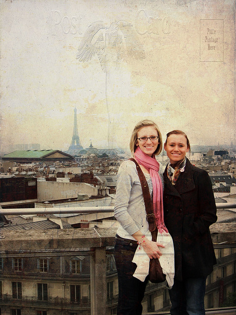
This photo was so much fun to work with in the first place, it was taken in Paris this last May
when myself and my two daughters and their BFF cousins spent a week there having a huge
adventure. So of course it brings back lots of fabulous memories.
So here we are on the rooftop of the department store "Galeries Lafayette"
with all of the Paris rooftops spread out before us and the Eiffel Tower in the distance. You'll see from the original
version that the photo could be called quite ordinary. Which is why I wanted to give it a
little boost and create something worthy of our photo gallery at home.
So here's what I did using Photoshop CS4 -
1. First, as always, I added a Levels Adjustment Layer and brought
the two outer sliders in towards the middle just a bit to boost the contrast.
the two outer sliders in towards the middle just a bit to boost the contrast.
2. Next, I added a Curves Adjustment Layer and created a slight
S-curve to to give the image a little more of a boost.
S-curve to to give the image a little more of a boost.
3. Then I ran a couple free actions available from Pioneer Woman.
First I ran Fresh & Colorful to boost the colors.
Then I ran Slight Lighten a couple of times to add some additional brightness to the image.
First I ran Fresh & Colorful to boost the colors.
Then I ran Slight Lighten a couple of times to add some additional brightness to the image.
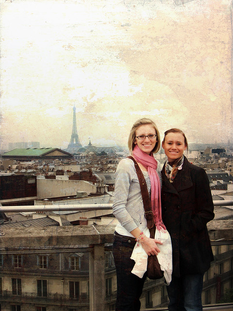
4. Next, I added a Hue/Saturation Adjustment Layer and selected Colorize.
I chose a sepia tone and set the layer to Soft Light blending mode with the Opacity set to
55% where you start to see the color added back in, but you see an overall
soft warm tone to the photo.
I chose a sepia tone and set the layer to Soft Light blending mode with the Opacity set to
55% where you start to see the color added back in, but you see an overall
soft warm tone to the photo.
5. Now I had some fun with textures! I really wanted to do something to add some
art work to the photo and capture the feeling of being in Paris on a
LOVELY adventure.
I chose two textures from my 2econd skin and from Shadowhouse. (You'll find a huge library of FREE textures listed below). First I applied Old Find 5 set to Multiply blending mode with the Opacity adjust down to 50%. Then I applied Old Post Card and tried the various blending modes with the Opacity adjusted down from 22- 37% I think my favorites are colordodge, overlay and vivid.
6. Finally I sharpened the photo using the High Pass Filter. It's a fabulous underused sharpening tool which I've created my own action for (I see another tutorial coming here . . .) the steps are 1. create a duplicate layer, click on menus - layers, show all, other, high pass, adjust the pixels down to about 1-3 pixels. Change the blending mode to hard (increased sharpening) or soft light (decreased sharpening), you can adjust the opacity slider also down to about 80% to fine tune the amount of sharpening you see. Flatten and save your photo!
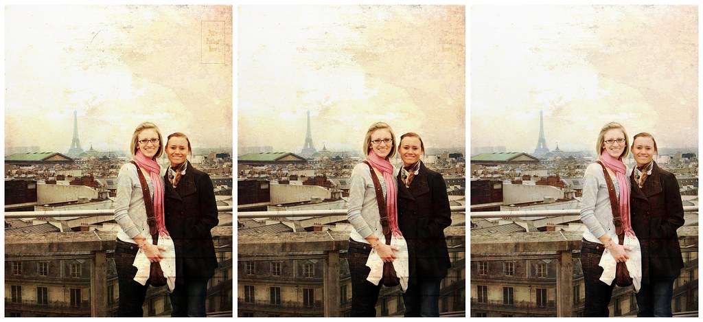
As you can see I saved all of them - and it made a lovely banner!
And here they are!
Here’s a before and after for you:
Here’s a before and after for you:
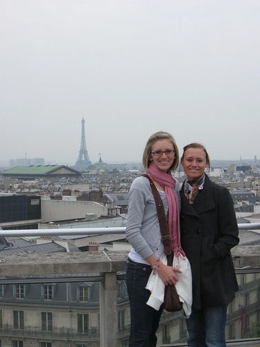
(here's a rather unattractive SOOC shot)
(lots of improvement - right after
the first texture is added)
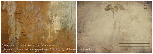
(There's soooooo many lovely free textures available
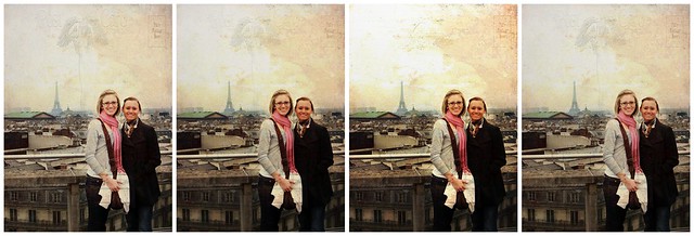
(look closely and you'll see some subtle blending mode differences)
(you can see them better with my flickr.com slideshow)
This is my favorite - for the overall color tone, skin tones, and preserving
Kristin ~picasa~ ~flickr~ Sony all the way! Sony A700 & A300
50mm/f1.7 Tokina 28-70 1.2.8, DT18-70mm/f3.5-5.6, DT55-200mm/f4-5.6 loving it! Personal Blog, Photo Blog
I LOVE this! Thanks SO MUCH for sharing.
ReplyDeleteHow am I just now finding out about this blog? It's fantastic!
Love you, as always you are perfect.